DATA ANALYSIS AND PHASE DETECTION DURING NATURAL DISASTER BASED ON SOCIAL DATA
Mohammad Rezwanul Huq, Abdullah-Al-Mosharraf and Khadiza Rahman
Department of Computer Science and Engineering
East West University, Dhaka, Bangladesh
ABSTRACT
Social media becomes a communicating channel during a natural disaster for detecting disaster events because people share their opinions, feelings, activity during the disaster through the Twitter. Twitter is not simply a platform for broadcasting information, but one of informational interaction. So, we use this platform for mining various disaster relevant tweets during a natural disaster. We examine more than 4,500 tweets during crisis moment. In this paper, we propose a classifier for classifying the disaster phases using social data and identify these types of phases. We use KNN, a machine learning classification algorithm for classifying the disaster relevant tweets. By knowing different phases of a disaster, response teams can detect where disaster will happen; the medical enterprise can be prepared to mitigate the damage after disaster and neighborhood area may also be alert to face the disaster. We classify the disaster-related tweets into three phases that are: pre (preparedness before the disaster event), on (during disaster event), post (impact and recovery after the disaster).We also take the geolocation with latitude and longitude of the disaster event for visualizing it using an earth map which can be useful to emergency response teams and also increase social awareness of the disaster.
KEYWORDS
Social Media, Natural Disaster, Phase Detection, Machine Learning, Geolocation, Awareness
1.INTRODUCTION
Social data now has become the popular media for extracting valuable information and a source that may contribute to situational awareness [23]. During the natural calamities people share their experience using tweet, and by seeing this tweet, we can understand that disaster is occurring in a particular area. Whenever Twitter users say rain is occurring or cyclone is acting to this area, by collecting this type of tweet we can detect in which area the natural disaster is occurring. Many researchers examined the disaster-related tweet for the sake of people and relied on a four-phase categorization (preparedness, response, impact, recovery) to mitigate their sufferings [2, 7]. So we think social network Twitter can be an excellent source for collecting twitter data during a natural disaster. We try to collect disaster relevant data from the Twitter and in previous studies focus on relevant data in disaster phases and extracted relevant tweets into many categories [25]. So the relevant tweet is extracted based on disaster keyword. Our main challenge is building a classifier for different phases and to classify the disaster relevant tweet and to identify various phases during a natural disaster. In this paper, we build a model for classifying the Twitter into three phases (pre, on, post). Moreover, we also show the geographical map of the affected are by visualizing and pointing out that type of different phases [19]. The main objective of our work is to help and inform the Medicine Company, people, and disaster response team about the impact of the catastrophe and to alert them. As we pointed out these phases on the Earth map, the response team can easily understand where and when this disaster is happening by seeing the map, and they can take immediate actions.
1.1. Tweets reflect phases during natural disaster
Twitter users tweet before the disaster for making awareness and during the natural disaster they tweet about the condition of nature, and after the disaster has occurred, they tweet for remediation. Here many types of tweet we find. Certain kinds of the tweets are like “be prepared for the Cyclone Debbie,” “Cyclone Debbie is coming,” and by seeing this kind of tweet, we can say it is a pre-status tweet. During a disaster event, some tweets are like, “it is raining” or “cyclone is occurring, ” and from these tweets, we can say that this place is current disaster zone area. After the disaster, people share their sufferings, impacts and damages happened by the disaster, and the tweets are like “food”, “help”, “injured”, “death”. By seeing these kinds of the tweet, we can say that for remediation food, fund or any kinds of help is needed in that area for the mitigation of damage. Besides tweet also reflect the geographical status of the disaster affected area, and by collecting this location with the GPS, we also pointed out these three phases on an earth map which will help to make situational awareness.
1.2. Motivation
Our main challenge is identifying different phases of the natural disaster using social data. For this reason, we try to classify the disaster relevant data into some phases. This classification provides a framework to predict the pre-status before the disaster event, the on-status during a disaster and the post-status after the disaster has occurred. We select social data for our work because there could be many informative tweets can be found from them. For understanding the disaster event, we classify the disaster data into three phases which are pre (preparedness, public alert, and awareness), on-time (during the disaster event), and post (impact, damage, remediation, recovery). By detecting pre-phase, emergency response team can say that this area is in the disaster zone. So they can make awareness among the people that a catastrophe is coming, so to get prepared. Doctor, nurse and medical enterprise may get ready for curing the affected people. They also make awareness between the neighborhood areas because there is a high probability of a disaster occurring in that area. Thus awareness can be performed before the disaster takes place and that is on the pre-status phase. When a disaster is happening in a particular area, people become rushed to fight against the disaster, and during a disaster event, electricity loss happens in most of the cases, and internet connection may cut down. So, during a disaster, only a few tweets can be found. Most of the time this type of tweet is about the impact of the weather or nature during the disaster, and that is in the on-time-status phase. By detecting the post-status phase, response team can know about the damage caused by the disaster and take quick action to recover the damage. Remediation is needed to help the affected disaster zone after the disaster has occurred. By detecting the post phase emergency, the concerned people should be transferred to the medical center and take immediate medical care and proper medicine to cure them. Besides by seeing the geographical map of that type of phases, people can get alerted, and response team can create a situational awareness.
1.3. Research Questions
We have carefully considered the following research issues to accomplish our goal. In fact, the answer to these questions contains the core concept behind our work.
1.3.1. Why do we select a keyword from Twitter?
During a disaster event, many tweets can be tracked from the Twitter. We use this social media for tracking disaster relevant data, and this data is needed for classifying into three phases which we were determined in our work. Besides tracking public data is very easy. Without extracting this disaster data, we could not be able to train our algorithm, and therefore we use Twitter data
1.3.2. Why do we need classifying disaster phases?
We need a classifier for classifying the disaster data into three classes and detecting each class of a tweet that it is in a particular phase. We can detect the phases by comparing the training data with the test data. So classifying disaster phases is needed for detecting disaster phases of a tweet
1.3.3. Why do we assign the weight of a tweet?
There may have some extra word in the keyword from which we cannot understand that what type of tweet is it. So basically ignoring the last letter of a word we match every word of a tweet with the relevant keyword which we manually extracted. Based on the matching keyword we assign a weight of a tweet. For declaring the phases of a tweet weight is needed.
1.3.4. Why do we use KNN algorithm?
KNN algorithm is easy to understand and easy to implement. This classification algorithm helps to predict the data with better accuracy. So we use this algorithm so that our result can be much better. As this method contributes to predict data, we compare this predicted data with our actual data and can measure whether our result is right or wrong.
1.4. Overview of the Proposed Solution
Our main goal is detecting disaster phases during a natural disaster. So we trained a classification algorithm for classifying disaster data into three phases that are pre-status (before the disaster), on-time-status (during a disaster) and post-status (after a disaster has occurred). So to fulfill our aim, first of all, we extract data from social media based on hashtag using Twitter 4j API. We also extract data using time-boundary and the bounding box (collecting data with latitude and longitude).As there were many noisy data, so we clean the data using C++ programming based on the disaster hashtags. For the data cleaning process, we match a tweet word with a relevant keyword (manually extracted) and if any word matches then it was considered as a relevant data otherwise noisy data. For keyword matching, we check and compare the tweet word and related keyword in three steps (matching the tweet word with relevant keyword directly, matching the tweet word with keyword considering the last letter of a word as a relevant keyword, also consider the increasing length of 1 of a word as relevant).According to this process, we assign a weight of a tweet. We also normalize the time into minutes based on the posting time of a file.
We use KNN algorithm to classify this relevant data into three phases using four descriptive features (pre-status weight, on-status weight, post-status weight, time in minutes) and test features as like 1,0,0 (indicates pre-status high); 0,1,0 (on-status high); 0,0,1 (post-status high); 1,1,0 (prestatus and on-status both are same and high); In this case confusion occur because we cannot detect the phases. We split the file of data into training data and test data according to 2:1 ratio that means the training data is 0.67 (67%) and the test data is 0.33 (33%). Then we trained our algorithm by calculating the Euclidian distance between each test data with all of the training data and take the nearest distances 5 data as the value of K we assign 5 and take the majority voted data from it. From that majority voted data we can predict the disaster phases.
We extract disaster relevant data manually and compare the actual data with the predicted data which we get after classifying and show how accurate our result is. Then we get the accuracy of our result based on the correct prediction. We also visualize and demonstrate the percentage of three phases using a pie-chart and graphically represent the data with the posted time in minutes using axis-chart. After that, we create a map using the latitude and longitude of the affected area. In an earth map, we try to point out the particular area under each disaster phase.
After completing this classification step, we evaluate our result by calculating the precision, recall, F1-measure of each phase and the overall accuracy of our paper.
2. BACKGROUND
We extract social data using Twitter 4j API and assign a weight of a status. For calculating the weight we need max time and min time of tweets (in minutes) which is in the file, also need a ratio which we identified using a ternary search [14, 21]. We classify the disaster data into three phases. For classifying disaster phases, we use a machine learning algorithm that is KNN to predict the different phases and also use confusion matrix for calculating the accuracy of our experiment. Then we use matplotlib library for visualizing our work and create pie-chart, axischart, and Earth-map.
2.1. Twitter 4j API
Twitter4J is a Java library for the Twitter API [12]. With Twitter4J, we can easily use our Java application with the Twitter service. The Twitter Platform connects our website or application with the global conversation happening on Twitter. To get the recent tweets based on hashtags, we can use streaming API through which we can extract the data.
2.2. Ternary Search
For finding a maximum or minimum point in U-shape graph, the ternary search is the best choice. A ternary search [14, 21] is an example of a divide and conquer algorithm. A ternary search determines either that the minimum or maximum cannot be in the first third of the domain or that it cannot be in the last third of the domain, then repeats on the remaining two-thirds.
2.3. K-nearest Neighbor (KNN)
A K-nearest neighbor is a machine learning classification algorithm [8]. It is a similarity base learning. Whenever we have a new point to classify, we find its K-nearest neighbor from the training data and the new point is assigned from the majority of classes. The distance is calculated by using the following measures: Euclidean, Minkowski, Manhattan. In classification problems, KNN is most commonly used. The main drawback of KNN is the complexity in searching the nearest neighbor for each sample. We implement this algorithm in Python [20].
2.4. Matplotlib
Matplotlib [13] is a plotting library for the Python programming language and its numerical mathematics extension NumPy. It provides an object-oriented API for embedding plots into applications using general-purpose GUI toolkits. Pyplot is a matplotlib module which provides an MATLAB-like interface. Matplotlib is designed to be as usable as MATLAB, with the ability to use Python, with the advantage that it is free. We also use multiple maps using subplots [19].
2.5. Confusion matrix
Confusion matrix contains information about actual and predicted classifications done by a classification system and describes the performance of a classifier model [9]. For evaluating the performance [18] of such systems, we have to use the data in the matrix.
3. RELATED WORK
Many researchers provide disaster-related information during a natural disaster using social data. Ashktorab et al. [1] introduce tweedr, a twitter-mining tool, which extracts actionable information during a natural disaster for helping disaster responder team. The tweedr pipeline consists of three main parts: classification, clustering, and extraction. Some researchers also make an automatic method for extracting information nuggets [3] so that they can help professional emergency responders and the Twitter data has been categorized into different features such as Caution, Advice, Fatality, Injury, Offers of Help, Missing and General Population Information. Recently it has been found that for helping emergency responders to act quickly for disaster response and disaster relief, actionable data can be extracted from social media. Here [4] a tweet tracker tool has been proposed. During disaster, by tracking and monitoring disaster-related twitter data researchers help Humanitarian Aid and Disaster Relief (HADR) respondents for gaining valuable insights and situational awareness in the affected area
Many studies have applied to work with geographic locations of tweets of the disaster event to help the emergency response team to make situational awareness. Social media messages have been separated into four categories (preparedness, response, impact, and recovery) [2] to understand the disaster event, and this framework has been done with the relevant tweet to take action quickly and efficiently in the impacted communities. Other researchers also describe the use of disaster phases (mitigation, preparedness, emergency response, and recovery) [7] which has assisted both disaster researchers and managers. In this paper, it has been suggested that the use of disaster phases can improve the theoretical and applied dimension of the field during disaster periods and also mentioned that disaster researchers have used disaster phases to organize significant findings and recommendations about disasters.
Big Data can help in all four phases of disaster management [22]. However, significant big data research challenges arise because of disaster management requirements for quality of service (e.g., highly available real-time response) and quality of information (e.g., reliable communications on resource availability for the victim). Besides, social data is a source of extracting valuable information to make situational awareness [23]. The goal of this paper is to identify and measure features that could support technology in analyzing mass emergency situations. The contribution of this article is considering “situational update” information that is communicated by people through micro blogging in mass emergency situations.
It has been described that annotating social media data with geographic coordinate is more valuable for quickly finding out the area under the victim [5]. Twitter user locations are being estimated by propagating the locations of GPS-known users across a Twitter social network. A method has been invented to locate the overwhelming majority of active Twitter users by examining their locations. The algorithm assigns a location to a user based on the locations of their friends by calculating the min, median and max distance between their friends. Moreover, the automatic geolocation of social media messages is beneficial [10]. They analyze that since different people, in different locations write messages at different times; these factors can significantly vary the performance of a geo-location system over time.
In this paper, they consider the task of tweet geo-location, where a system identifies the location where a single tweet was written. Here [11] it has been investigated and improved on the task of text-based geo-location prediction of Twitter users. They present an integrated geo-location prediction framework and investigate what factors impact on prediction accuracy. Here they evaluate the impact of temporal variance on model generalization and discuss how users differ regarding their geo-locatability.
The contributions of this paper [6] are to introduce AIDR (Artificial Intelligence for Disaster Response), a platform designed to perform automatic classification of crisis-related social data. The objective of AIDR is to classify messages that people post during disasters into a set of userdefined categories of information (e.g., “needs”, “damage”) For this purpose, the system continuously ingests data from Twitter, processes it (i.e., using machine learning classification techniques). Imran et al. [25], extracted tweets into several categories, caution and advice, casualty and damage, donation and offer, and information source during a natural disaster. A platform AIDR is also described here, which collects human annotations over time to create and maintain automatic supervised classifiers for social media messages.
The contribution of this paper [15] is that conducting a systematic comparative analysis of nine state-of-the-art network-based methods for performing geolocation inference at the global scale. The analysis identifies a significant performance disparity between that reported in the literature and that seen in real-world conditions. All implementations have been released in an open source geo-inference package to aid reproducibility and future comparison.
Lie et al. [16] declare that Twitter data contains valuable information that has the potential to help improve the speed, quality, and efficiency of disaster response. However, supervised learning algorithms require labeled data to learn accurate classifiers. Experimental results suggest that, for some tasks, source data itself can be useful for classifying target data. However, for tasks specific to a particular disaster, domain adaptation approaches that use target unlabeled data in addition to source labeled data are superior.
This paper [17] presents a CyberGIS framework that can automatically synthesize multi-sourced data, such as social media and socioeconomic data, to track disaster events, to produce maps, and to perform statistical analysis for disaster management. In this framework, Apache Hive, Hadoop, and Mahout are used as scalable distributed storage, computing environment, and machine learning library to store, process and mine massive social media data. Several attempts have taken to illustrate volunteered geographical data (VGI) [24]. Volunteered data obtained through Google news, videos and photos are added to modify the contour regions. A new methodology for the generation of flood hazard maps is presented using remote sensing and volunteered geographical data.
4. PROPOSED SOLUTION
Our solution consists of several computational steps. Figure 1 shows the flow chart of the
proposed solution. In this section, we describe each computational step in detail.
4.1. Collecting Data
We collect tweet from Twitter using Twitter4j API in JAVA based on hashtags. Using those hashtags, we collect randomly 4,500 tweets without any bounding-box and no timebound.
4.2. Keyword Selection
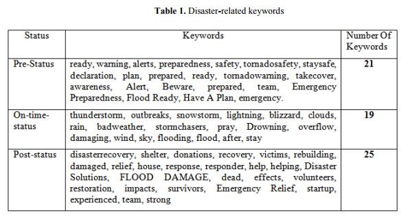
From 4500 tweets, we select a total number of 65 keywords and classify them into three different phases – Pre-Status, On-time-Status, and Post-Status. Table 1 shows these keywords. Sometimes some keywords are classified under one phase, but due to the presence of another word, the actual meaning of the tweet could be divided into a different phase. As for example, consider tweets – “Response teams are coming” and “response teams are working”. Here the former belongs to “Pre-Status” and the latter belongs to “Post-Status”. Therefore, we keep another checking to solve this type of problem. Table 2 shows the list of this type of keywords.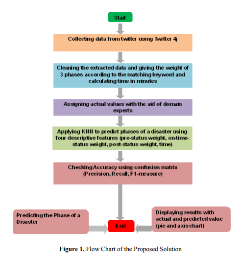

4.3. Assigning Weight of a Tweet
We formulate an equation to assign a weight of a tweet. The equation is:

In Eq. 1, time is measured in minutes. Number of matches is the number of keyword matches with the words of a tweet. We consider three rules for counting matches.
i. Directly and equally the keyword and a word of a tweet is matched.
Example: (“rain”[Keyword] and “rain”[A word of tweet]).
ii. If there is any last letter like „.‟(dot), „,‟(comma), „?‟(interrogation symbol and
„!‟(Exclamatory symbol) then we ignore it and check without it, Example:
(“rain”[Keyword] and “rain.”[A word of tweet]).
iii. If a keyword matches completely but the word_of_tweet_length – Keyword_length = 1
then we accept that as a match. (“wind”[Keyword] and “winds”[A word of a tweet]).
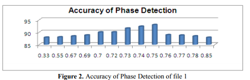
The ratio is found by using ternary search. Lower bound and upper bound of ternary search is 0.0 and 1.0. The actual value is calculated by taking the average accuracy of five random iterations of each ratio point. Figure 2 shows the justification of taking ratio = 0.75.
4.4. Providing the Ground Value
We provide the ground value of all tweets manually by reading all cleaned tweets and determine their original value.
4.5. Predicting Phase of the Tweet
Now we use KNN [K=5] to predict the phase of a tweet. 67% data are using as a training set and 33% used as a test set of a data file. There are four characteristic features in the dataset (e.g. PreStatus, On-time-Status, Post-Status, Time) and three target features (Pre-Status, On-time-Status, Post-Status). As an example, the weight of the Pre-status is higher than the other two target features the value of 3 target features would be [1, 0, 0].
Now program selects five nearest training dataset by using Euclidian distance. The three phases point is counted from the target features of these 5 data and returns the phase which gets the maximum number of point and predicts that as the phase of that tweet Now we compare the predicted value with the actual ground value. We build a confusion matrix based on the average of 5 iterations.
We take the last 10% data whose predicted value and the actual value is equal. Afterward, we count which phase occurs most from these tweets and then select that phase.
4.6. Demonstration of the Proposed Solution
In Queensland, Australia recently a Cyclone named Debbie has occurred. This disaster hits the Queensland in the evening of 28th March 2017. We collect tweets in three steps based on two hashtags (e.g. #Cyconedebbie, #disaster). Table 3 shows the overview of this data collection.
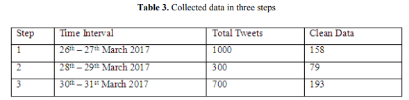
There are 4 files of dataset, file1 has step-1 data (pre-status), file2 has step-2 data (on-timestatus), file3 has step-3 data (post-status) and file4 has all data (three-status).
Then we give the actual value of all these tweets manually trained the KNN algorithm to predict the phase of these data.
4.6.1. Visualization of file1
In Figure 3, we visually represent the percentage of the actual value and the predicted value of phase1 using a pie chart. From here we can see that in pre-status phase the percentage of data is 85.11 (actual) and 77.08 (predicted), in on-status phase the percentage are 14.89 (actual) and 22.92 (predicted), whereas in post-status phase there is 0.00% data in both cases. As in pre-status phase in both actual and predicted the percentage is higher than another two phases so we can say that this chart indicates that this data is under pre-status phase. When we collect data from cyclone-Debbie there, we see that whenever people tweet for the awareness before the cyclone in that time cyclone has been beginning and so during the pre-status phase, people were posting an
on-status tweet. So we get tweets in on-time-status.

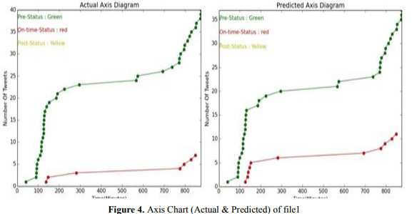
In Figure 4, the actual data and predicted data of phase1 are graphically represented using axis diagram. Here we visualize three phases using three colors (green for pre, red for on, yellow for the post). In this figure, the x-axis represents the Time in minutes, and the y-axis is the Number of Tweets. The circled point indicates the data of each phase including time represented by the color. By comparing and observing the actual and predicted data we can understand that in pre-status phase there are many data and in on-status phase, there are little bit data and here is no yellow data so post-status phase is empty. By observing the data, we can understand that this is pre-status data because the number of tweets is higher in pre-status phase in both cases.
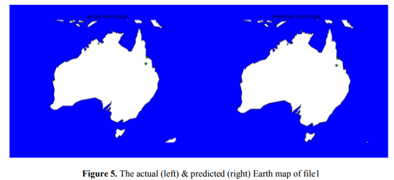
Figure 5 shows two tiny green stars pointing out the affected area [both for actual and predicted data]. As a green star represents as Pre-Status, we can say that this is under Pre-Status phase. By seeing the visualization of file1, we can observe that our solution declares step1 (26th -27th , March 2017) was the Pre-Status phase.
4.6.2. Visualization of file2
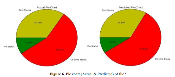
Figure 6 describes the visual representation of the actual and predicted value of phase2 using piechart. By comparing figures of actual and predicted values, we can see that the percentage of data in pre-status phase is 9.38 (actual) and 9.09) (predicted), in on-status phase percentage is 56.25(actual) 57.58 (predicted), whereas in post-status phase it is 34.38 (actual) 33.33 (predicted). We could say that in on-status phase the percentage is higher than the two. So we could say that we correctly predict that this is in on-status phase because actual and predicted value is almost same.
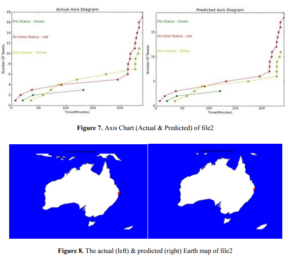
In Figure 7, the actual and predicted data of phase2 is graphically represented using axis diagram. Here we visualize three phases. By comparing the actual and predicted value, we can understand that in on-status phase there is a higher data than the two. By observing the data, we can understand that this is in on-status phase though there are post-status data because of the flooding during the cyclone.
From Figure 8 we can see that a tiny red circle is pointing out the affected area. As a red circle represents as On-time-Status, we can say that this is under On-time-Status phase. By seeing the visualization of file2, we can observe that our solution declares step2 (28th
-29th , March 2017) was the On-Time-Status phase.
4.6.3. Visualization of file3
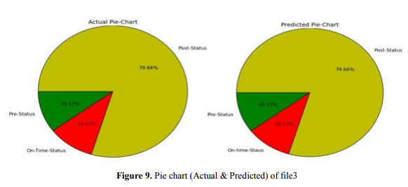
From this figure (Figure 9) of actual and predicted value by comparing the percentage of three statuses we see that the percentage of pre-status and the on-status phase is same (10.17) for both cases and in post-status phase, 79.66 (actual and predicted). As the percentage of post-status
phase is higher than another two phases so we can say that this chart indicates that this data is under post-status phase. A little bit of pre-status and on-status phases also here.
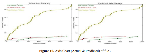
The actual and predicted data of phase3 is graphically represented using axis diagram. From this chart, we can see that yellow circle point indicates the higher data than the red and green data. As the yellow color represents the post-status phase, so by observing the data, we can understand that this is in post-status phase. So we can predict well that this is post-status data.
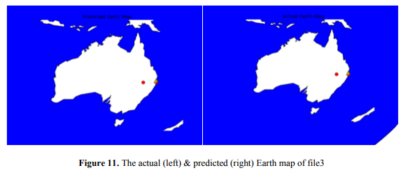
From this figure (Figure 11), we can see that two tiny red circles & two yellow triangles pointing out the affected area. As red circle represents as On-time-Status, and yellow triangle represent Post-Status. So we can say that this is under On-time-Status and Post-Status phase.
By seeing the visualization of file3, we can observe that our solution declares step3 (30th -31th , March 2017) was the Post-Status phase.
5. EXPERIMENTAL RESULTS AND PERFORMANCE EVALUATION
Here we calculate some comparison results in all three file using confusion matrix and find Precision, Recall and F1-measure from 5 random iterations of those files.
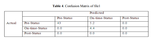
5.1. Confusion Matrix of file1
In this confusion matrix as shown in Table 4, from the 48.2 actual pre-status tweets, the program can predict that 43 were pre-status tweets and 5.2 were on-status tweets, and from the actual 4.4 on-status tweets, the program can predict 4.4 on-status tweets correctly and here is no post-status tweets. The accuracy of file1 we get is 90.11%.
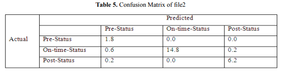
5.2. Confusion Matrix of file2
In this confusion matrix as depicted in Table 5, from the 15.6 actual on-time-status tweets, the program can predict that 14.8 were on-time-status tweets, 0.6 were pre-status phases, and 0.2 were post-status tweets, and from the actual 6.8 post-status tweets, the system can predict 6.2 post-status tweets. The accuracy of file2 we get is 95.70%.
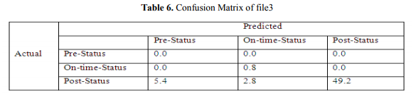
5.3. Confusion Matrix of file3
In this confusion matrix (see Table 6), from the 57.4 actual post-status tweets, the system can predict that 49.2 were post-status tweets, 5.4 were pre-status tweets, and 2.8 were on-time-status tweets, and from the actual 0.8 post-status tweets, the system can predict 0.8 post-status tweets. The accuracy of file 3 is 85.90%.
5.4. Performance Evaluation using Precision, Recall and F1-measure
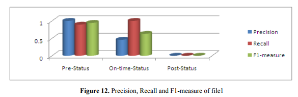
Figure 12 shows precision, recall, and F1-measure of tweets of file 1. We get precision (1.000), recall (0.892) and F1-measure (0.942) of pre-status tweets. In on-status it is, precision (0.458), recall (1.000) and F1-measure (0.682). Similarly, for post-status,
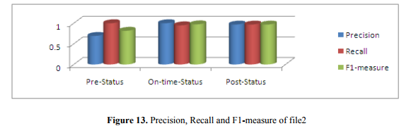
In Figure 13, we get precision (0.692), recall (1.000) and F1-measure (0.817) of pre-status tweets. In on-status, precision (1.000), recall (0.949) and F1-measure (0.973). In post-status, precision, recall, and F1-measure value are same (0.968). This measurement indicates that this is on-timestatus.
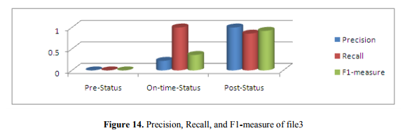
The result of file3 is shown in Figure 14. We get no precision, recall, and F1-measure is
ambiguous of pre-status tweets. In on-status, precision (0.222), recall (1.000) and F1-measure (0.360). In post-status, precision (1.000), recall (0.857) and F1-measure (0.922). From this measurement, we can say that this is post-status tweets.
6. CONCLUSION AND FUTURE WORK
Twitter is a popular social media, and during natural disaster or any other crisis moment this source is beneficial for tracking the disaster data to alert people or helps the affected people. In our work, we track this twitter data with latitude and longitude using text mining technique during a disaster, Cyclone Debbie in Queensland, Australia (26 March to 31 March 2017, three steps). A machine learning classifier technique is introduced here to categorize these messages. Our aim was to measure and classify these tweets into three phases (pre, on, post) and detect the phases. We also visualize the actual and predicted value of each category phases using pie chart and axis chart and seeing this graph we can easily compare the actual data and the predicted data and the percentage of each phase and also visualize our experimental result by showing the earth map and pointing out these three phases on that map. Our result indicates that there is an increasing number of classification accuracy and we calculate this using confusion matrix. We also take the screenshot of the accuracy of each category phases and the all the phases to show our result how accurate it is.
In future, the most damaged area of a disaster can be pointing out by using our work so that by seeing the pointed map affected people can get help, food, and donation by the response team. Our paper is also helpful for examining the disaster tweet with their geo-location by mapping. In future, the more risky zone of a disaster can also be finding out so that people can alert and make a recovery plan or leave the dangerous area for reducing the damage. Also, it can be possible to predict the nature and the danger level during a natural disaster. It is also feasible to visualize the live disaster moment in future and will be very helpful for disaster responder. By visualizing the live disaster event, it will be straightforward to find out the area under the disaster event.
REFERENCES
[1] Z. Ashktorab, C. Brown, M. Nandi and A. Culotta, Tweedr: Mining Twitter to inform disaster response. In: Proceedings of the 11th International ISCRAM Conference, USA, 2014.
[2] Qunying Huang and Yu Xiao, Geographic Situational Awareness: Mining Tweets for Disaster Preparedness, Emergency Response, Impact, and Recovery. In: ISPRS Int. J. Geo-Information, 2015, 4(3), 1549-1568.
[3] P. Meier, C. Castillo, M. Imran, S. M. Elbassuoni, and F. Diaz, Extracting information nuggets from Disaster-related messages in social media. In: 10th International Conference on Information Systems for Crisis Response and Management, 2013.
[4] S. Kumar, G. Barbier, M. A. Abbasi, and H. Liu, Tweet Tracker: an analysis tool for humanitarian and disaster relief. In: ICWSM, 2011.
[5] Ryan Compton, David Jurgens and David Allen, Geotagging One Hundred Million Twitter Accounts with Total Variation Minimization. In: International Conference on Big Data (BigData), IEEE, 2014, 393-401.
[6] M. Imran, S. Elbassuoni, C. Castillo, F. Diaz, and P. Meier, Practical extraction of disaster-relevant information from social media. In: Proceedings of the 22nd international conference on World Wide Web companion, Republic and Canton of Geneva, Switzerland, 2013, 1021-1024.
[7] D. M. Neal, Reconsidering the phases of disaster. In: Int. J. Mass Emerg. Disasters, 15, 1997, 239– 264.
[8] Siddharth Deo Kar, Lecture Notes on K-nearest Neighbor Algorithm.
http://www.csee.umbc.edu/~tinoosh/cmpe650/slides/K_Nearest_Neighbor_Algorithm.pdf
[9] http://faculty.smu.edu/tfomby/eco5385_eco6380/lecture/Confusion%20Matrix.pdf (accessed on Feb 02 2017)
[10] Mark Dredze, Miles Osborne, and Prabhanjan Kambadur, Geolocation for Twitter: Timing Matters. In: Proceedings of NAACL-HLT, 2016, 1064-1069.
[11] Bo Han, Paul Cook and Timothy Baldwin, Text-Based Twitter User Geolocation Prediction. In: Journal of Artificial Intelligence Research, 49, 2014, 451-500.
[12] Twitter 4j API: twitter4j.org/en/ (accessed on Jan 11 2017)
[13] Matplotlib library: http://matplotlib.org/index.html (accessed on Jan 11 2017)
[14] Ternary Search: https://en.wikipedia.org/wiki/Ternary_search (accessed on Jan 01 2017)
[15] D. Jurgens, T. Finnethy, J. McCorriston, Y.T. Xu, D. Ruths, Geolocation Prediction in Twitter Using Social Networks: A Critical Analysis and Review of Current Practice. In: ICWSM, 2015, 188-197.
[16] H. Li et al. Twitter Mining for Disaster Response: A Domain Adaptation Approach, In: 12th International Conference on Information Systems for Crisis Response and Management, 2015.
[17] Q.Huang et al. DisasterMapper: A CyberGIS framework for disaster management using social media data In: Proceedings of the 4th International ACM SIGSPATIAL Workshop on Analytics for Big Geospatial Data, ACM, 2015, 1-6.
[18] S. Visa et al. Confusion Matrix-based Feature Selection, In: MAICS, 2011, 120-127.
[19] http://basemaptutorial.readthedocs.io/en/latest/subplots.html (accessed on Jan 11 2017)
[20] http://machinelearningmastery.com/tutorial-to-implement-k-nearest-neighbors-in-python-fromscratch/ (accessed on Jan 13 2017)
[21] Ternary search algorithm: http://codeforces.com/blog/entry/3560 (accessed on Jan 01 2017)
[22] C. Pu, M. Kitsuregawa, Big Data and Disaster Management: A Report from the JST/NSF Joint Workshop. Georgia Institute of Technology, CERCS, 2013.
[23] S. Vieweg, A.L. Hughes, K. Starbird, L. Palen, Microblogging during two natural hazards events: What Twitter may contribute to situational awareness. In: Proceedings of the 2010 SIGCHI Conference on Human Factors in Computing Systems, USA, 2010, 10–15.
[24] E. Schnebele, G. Cervone, Improving remote sensing flood assessment using volunteered geographical data. In: Nat. Hazards Earth Syst. Sci. 13, 2013, 669–677.
[25] M. Imran, S. Elbassuoni, C. Castillo, F. Diaz, P. Meier, Practical extraction of disaster-relevant information from social media. In: Proceedings of the 22nd International Conference on World Wide Web Companion, Brazil, 2013
Authors